

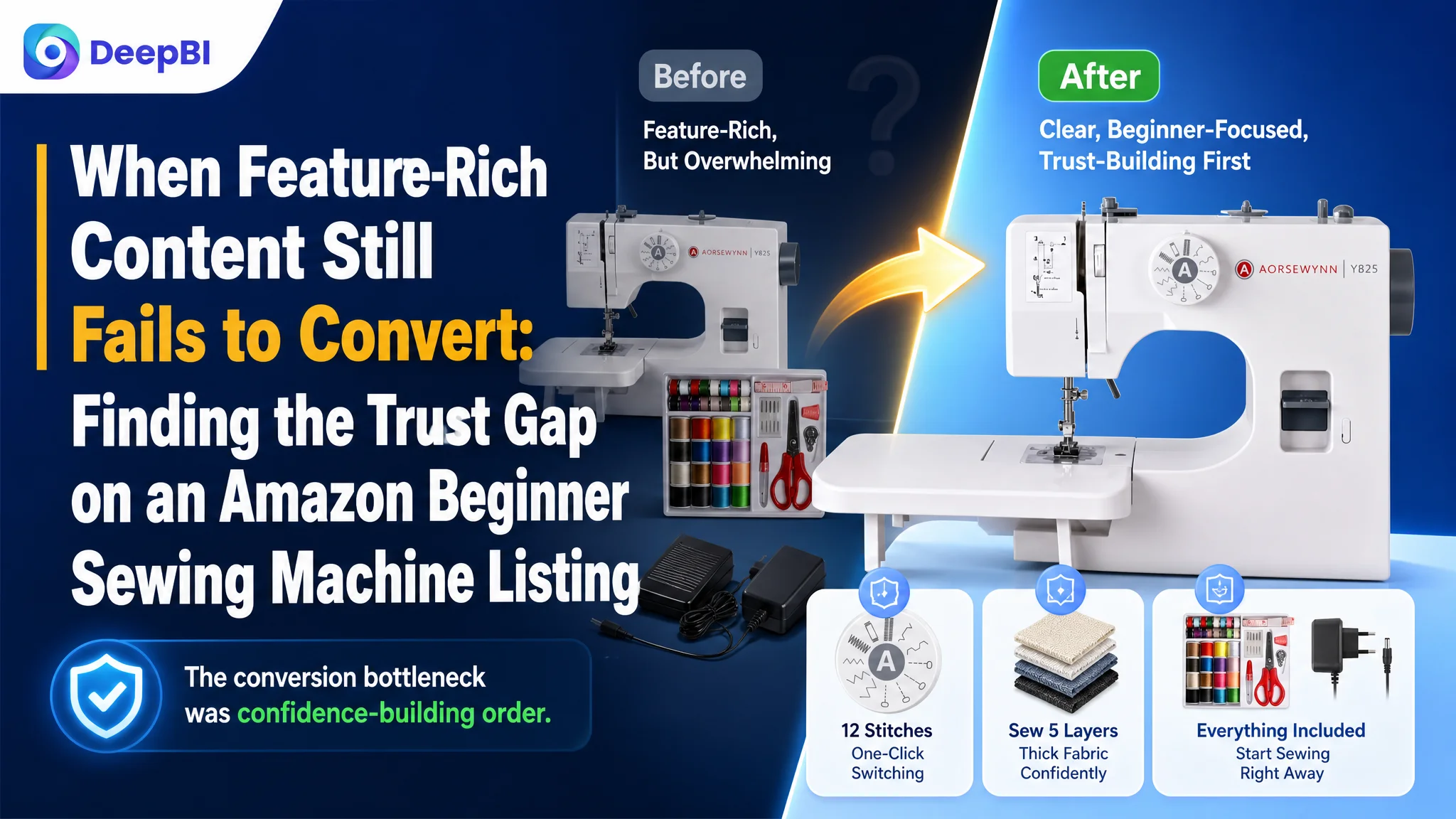
This case follows an Amazon seller whose portable sewing machine Listing appeared to contain plenty of product information, yet still lacked the decision logic needed to convert shoppers. The customer initially looked toward more technical explanations, more feature coverage, and stronger visual presentation as the answer.
DeepBI’s diagnosis pointed to a different constraint. The page was not short of content; it was short of a clear path from “I am considering this machine” to “I feel confident buying it.” The largest gaps were in the five-point structure, review credibility, beginner-oriented communication, and the order in which functional proof appeared.
The later optimization therefore focused on rebuilding the Amazon product page around trust and use cases: clarify the title, make portability and ease of use visible earlier, turn the five points into a benefit-led buying path, and place safety, control, power, and fabric guidance before deeper technical instructions. For other Amazon sellers, the case is a reminder that adding more information does not necessarily improve Listing conversion. The question is whether the page answers the buyer’s concerns in the right order.
The Listing Looked Complete. The Buying Logic Was Not
The product was a portable household sewing machine aimed at beginners and everyday DIY use on the US Amazon marketplace.
At first glance, the Listing had several strengths:
- A complete accessory kit
- An extension table
- Multiple stitch applications
- Two speed settings
- A foot pedal
- LED lighting
- Reverse stitching
- Fabric-layer capability
- A detailed A+ section
- Operation and safety guidance
The product page was not empty. It was not missing every visual asset. It did not lack technical material.
But DeepBI’s comparison showed that content volume and conversion readiness were not the same thing.
- Overall score: Customer Listing: 59/100, Comparable high-performing Listing: 77/100, Gap: -18
- Title: Customer Listing: 14/20, Comparable high-performing Listing: 16/20, Gap: -2
- Main image: Customer Listing: 24/30, Comparable high-performing Listing: 25/30, Gap: -1
- Five bullets: Customer Listing: 0/10, Comparable high-performing Listing: 7/10, Gap: -7
- Detail content: Customer Listing: 21/25, Comparable high-performing Listing: 19/25, Gap: +2
- Reviews: Customer Listing: 0/15, Comparable high-performing Listing: 10/15, Gap: -10
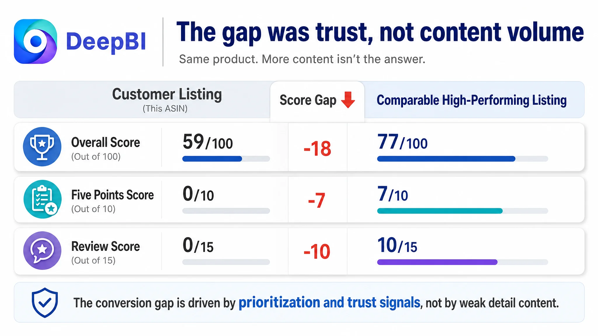
The overall score did not point to a single cosmetic defect. It showed a page whose individual assets were not working together as a persuasive system.
The central issue was not a lack of product information. It was a lack of confidence-building order.
The Original Assumption: More Technical Proof Would Close the Gap
The customer’s existing Amazon Listing invested heavily in feature explanation.
The image sequence included a practical feature overview, close-up function images, operating steps, power and control details, an accessory list, error examples, safety guidance, and a video guide. The A+ content also contained structured teaching modules and a broad set of feature icons.
That approach was understandable. A sewing machine has many details that can create uncertainty:
- Is it suitable for a beginner?
- Can it handle more than one type of stitch?
- Is it stable enough for larger fabric?
- Does it feel like a real household machine or a toy?
- How is it powered and controlled?
- What happens if the thread breaks or the needle is used incorrectly?
The team had tried to answer these questions through technical coverage.
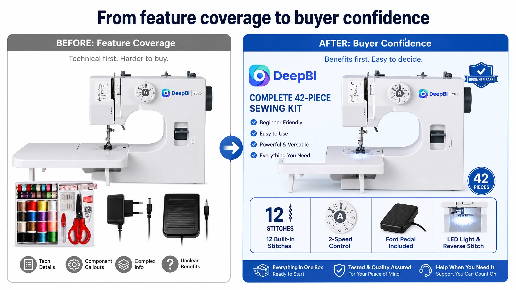
The problem was that the page often answered them as operating instructions rather than purchase reassurance. A buyer did not first need to understand every component. The buyer needed to know whether the machine was suitable, manageable, safe, and appropriate for the intended fabric and project.
The page was explaining how the machine worked before fully proving why a beginner should feel comfortable choosing it.
The Data Reframed the Problem
DeepBI’s scoring comparison changed the order of attention.
The most visible weakness was not the A+ score. In fact, the customer Listing scored 21 out of 25 on detail content, two points above the comparable high-performing Listing. The existing A+ material was relatively rich and visually consistent.
The more serious gaps were elsewhere:
- The five-point section received no score because it lacked usable decision content.
- The review signal was extremely weak, with two total reviews and a 2.6-star rating.
- The title contained relevant terms but placed too many claims into a dense structure.
- The main image sequence did not make the most important beginner benefits obvious early enough.
- The detail content contained useful material, but its sequence placed technical explanations ahead of basic reassurance.
This led to a more precise judgment:
The Listing’s conversion bottleneck was not content quantity. It was the failure to convert product capability into buyer confidence.
That distinction mattered because the wrong response would have been to keep adding modules, diagrams, and specifications. The page needed prioritization before expansion.
The Five Points Were the Clearest Conversion Leak
The five-point section was the most severe content gap in the comparison.
A competitor’s bullets established a complete purchase narrative:
1. How the machine could be powered and started
2. How speed and double-thread stitching supported different users
3. What accessories were included
4. Why the product suited beginners
5. Why arriving pre-threaded indicated factory testing
The customer Listing did not provide an equivalent structure.
This meant shoppers had to extract important information from images and A+ content without receiving a concise, scannable explanation near the core product details. On Amazon, that creates unnecessary friction. Buyers may see a feature in an image but still lack the sentence that connects the feature to their use case.
The revised direction was to make each bullet answer a practical buyer question.
Power and control should reduce setup hesitation
The first bullet was structured around dual power options and two ways to operate the machine: the power button or the included foot pedal.
This was not merely a specification upgrade. It addressed two different concerns:
- Where and how can the machine be used?
- Can the user choose a control method that feels comfortable?
Speed and double-thread stitching should support different skill levels
The second bullet connected double-thread stitching with stronger seams and positioned the two speed settings as a way to match user experience and project requirements.
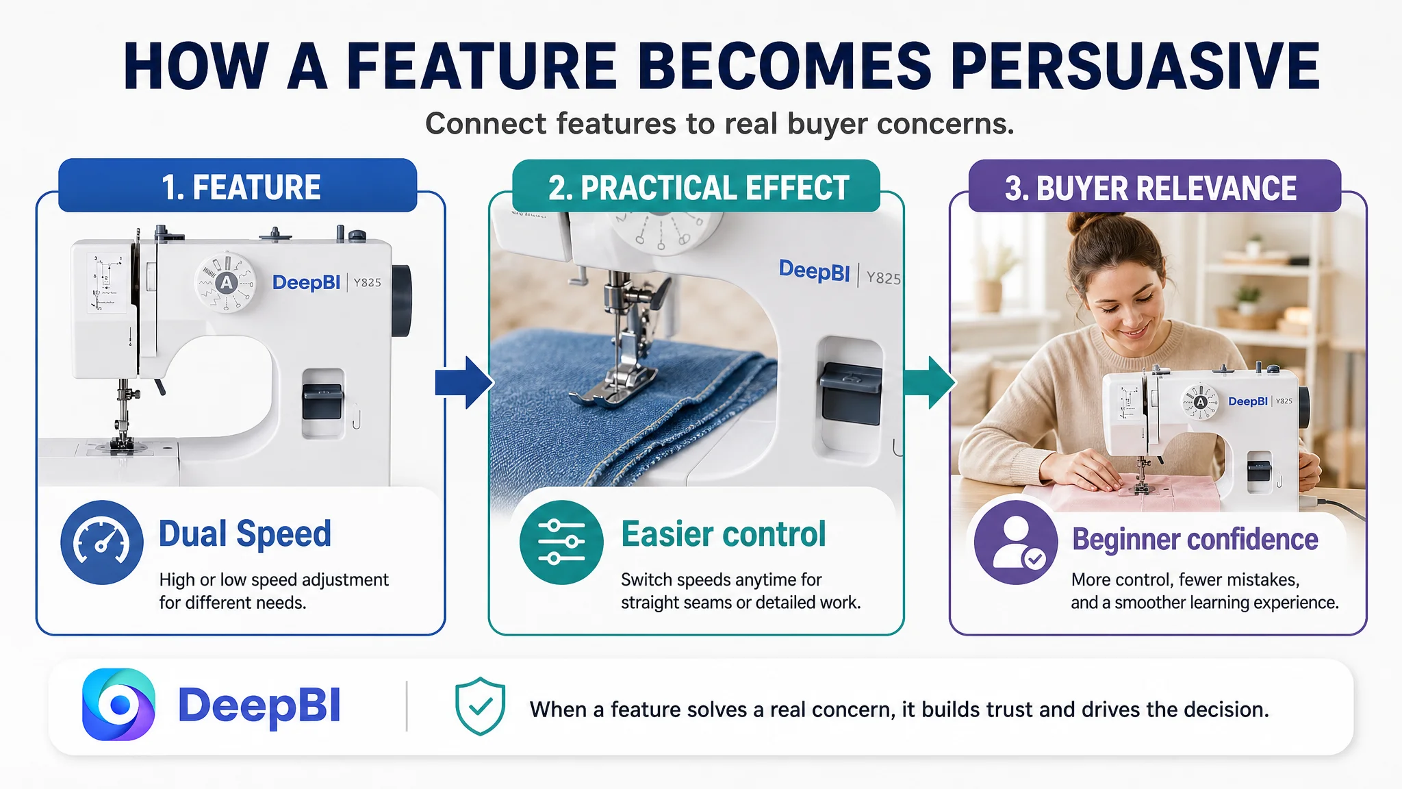
That creates a clearer benefit chain than listing speed as an isolated function:
Feature → practical effect → user relevance
The accessory kit should make the purchase feel ready for use
The third bullet brought the 42-piece kit, bobbins, needles, seam ripper, and extension table into one value proposition.
The extension table was especially important. It did more than add workspace. It addressed stability and larger household projects, which made the machine feel more complete and usable from the start.
Beginner suitability should be demonstrated, not asserted
The fourth bullet focused on marked threading directions, compact size, and basic household use.
A phrase such as “for beginners” is weak when it stands alone. The page needed to show what makes the machine easier for beginners: visible threading guidance, manageable dimensions, and a simpler operating path than an industrial machine.
Factory testing should become reassurance
The fifth bullet reframed the fact that the machine arrived threaded with a small piece of fabric.
Without explanation, that detail might create uncertainty. With explanation, it becomes evidence that the machine was tested before packaging and is ready for initial use.
The objective was not to make the bullets longer for their own sake. It was to make the Listing answer the buyer’s next question before the buyer had to ask it.
The Title Had Search Coverage but Weak Priority
The original title included the core term “Sewing Machine” near the beginning, but the structure became crowded with model information and multiple features.
Its problems were less about missing keywords than about hierarchy:
- “Sewing Machine” was not supported by a clean sequence of high-priority benefits.
- The model reference appeared too early.
- “12 Stitch Applications,” “2-Speed,” and “Reverse Stitch” competed for attention.
- “Heavy Duty” and “for Adults” appeared late, where mobile truncation could reduce their visibility.
- The title covered many long-tail terms but became harder to scan.
The proposed title reorganized the information around the customer’s actual competitive position:
Sewing Machine with Extension Table and 42-Piece Sewing Kit for Beginners, 12 Built-in Stitches, 2-Speed Portable Household Sewing Machine with Foot Pedal, LED Light and Reverse Stitching for Adults
The important change was not simply adding terms. It was establishing a more deliberate order:
1. Core product and major purchase package
2. Beginner relevance
3. Stitch variety
4. Portability and household use
5. Control and supporting functions
The title also replaced less natural phrasing such as “Stitch Applications” with “Built-in Stitches,” creating a cleaner balance between search relevance and readability.
The Main Image Sequence Was Showing Capability Before Relevance
The main image score was only one point behind the comparable Listing, so this was not the largest numerical gap. But qualitative analysis found a meaningful opportunity: the images did not always answer the buyer’s first questions in the right order.
The current sequence emphasized features and technical breakdowns. For a beginner-oriented sewing machine, the early visual path needed to establish:
- What the machine is
- How large and portable it is
- Whether it looks approachable
- What basic benefits it offers
- Whether it feels safe and manageable
The first image needed an immediate differentiator
The complete kit communicated value, but the machine itself looked relatively simple. The first supporting image should therefore make “12 Stitch Applications” visible as an early reason to consider the product, alongside the extension table and accessory kit.
Portability should appear before deeper stitch explanation
The existing stitch-variety image was useful, but it may have arrived too early. A buyer considering a compact machine often wants size confirmation first.
The recommended direction was to move portability and dimensions forward, using a clear comparison or size-confirmation image. Stitch information could then be integrated into a broader feature image rather than occupying an early position by itself.
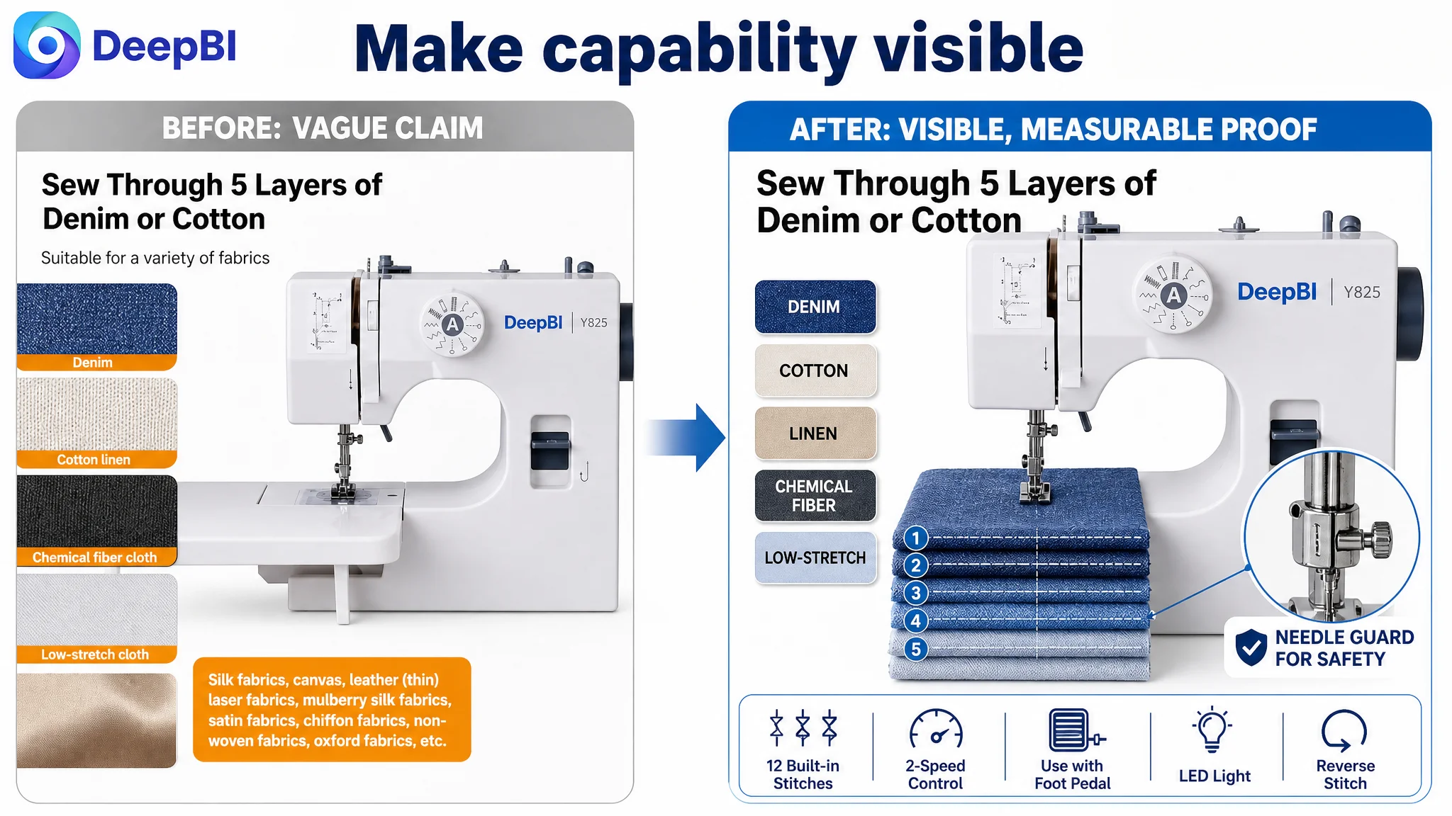
Fabric-layer capability needed clearer evidence
The product had a potentially strong claim around sewing multiple layers of fabric. However, the existing visual did not make the layered structure sufficiently obvious.
The revised image direction would show the five layers clearly under the presser foot and use more natural wording such as:
Sew Through 5 Layers of Denim or Cotton
This would turn a technical claim into visible proof while staying within the product information provided.
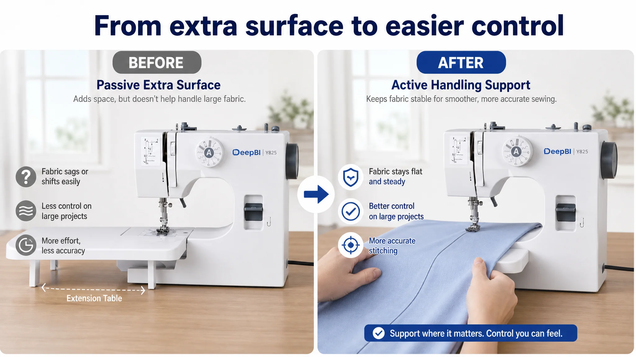
The extension table needed to show control, not just presence
A scene showing a person sitting with fabric on the table did not fully communicate why the extension table mattered.
A more persuasive visual would focus on the user’s hands guiding larger fabric with greater stability, or show how the table is attached and used. The purpose is to reduce setup and handling uncertainty.
The technical anatomy view was not the best use of attention
The component breakdown was detailed, but it served the product more like a technical diagram than a purchase argument.
The recommended replacement would center the user-facing controls:
- Reverse stitch button
- Two-speed control
- Foot pedal
- LED light
- Beginner-oriented safety or ease-of-use details, where supported by the actual product
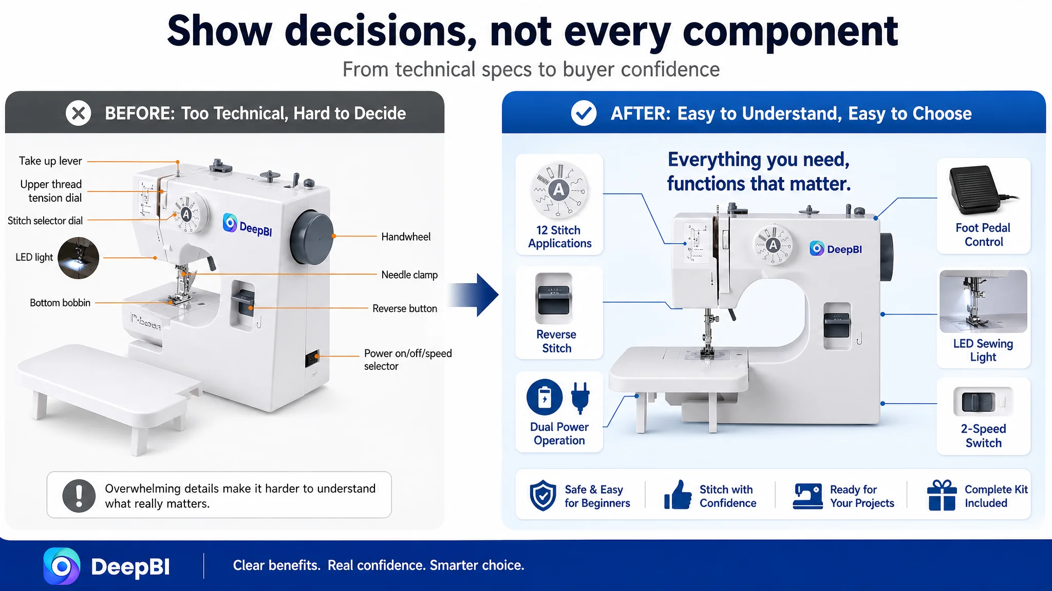
A main image is not a product manual. Its first job is to create a clear reason to continue.
The A+ Content Did Not Need More Information. It Needed Better Sequencing
The customer’s A+ content already had several strengths:
- A structured six-step operating guide
- A “16 Practical Features” overview
- Clear iconography
- Real product photography
- Operation and safety guidance
- Video, FAQ, and manual support references
This explains why the detail-content score was not the main weakness.
However, DeepBI’s diagnosis found that the A+ path still placed some information in the wrong decision order. It moved too quickly into feature detail and operating procedures before establishing basic functional confidence.
The recommended sequence was to rebuild the page around the buyer’s risk progression.
Start with stability and beginner suitability
The extension table should appear early, not as a late accessory. Its value is immediate: it provides a larger, more stable workspace and helps validate the claim that the machine is suitable for beginners and household use.
Establish basic controls before advanced capabilities
Two-speed control and LED lighting are easier for a buyer to understand than a dense feature overview. They should appear before deeper stitch and fabric-layer explanations.
Address the “toy or real machine” concern
Showing dual power options and the included foot pedal helps establish that the product supports conventional sewing behavior rather than functioning only as a novelty device.
Make safety visible
The finger guard and extension table should be presented as direct confidence builders. For a beginner, safety and stability are not secondary details. They can determine whether the buyer feels prepared to use the machine.
Convert instructions into risk prevention
The existing operating modules focused on steps such as handwheel use and thread-tension adjustment. Those instructions were useful, but they did not always explain the consequence they helped prevent.
The revised logic should connect the action to the risk:
- Correct threading to reduce thread breakage
- Proper tension adjustment to reduce needle breakage
- Clear control selection to prevent setup confusion
This turns a tutorial into reassurance.
Add a fabric compatibility chart before the technical close
A clear fabric chart would provide rational purchase confirmation. It would help buyers judge whether the machine fits their intended use instead of making them infer capability from general claims such as “heavy duty” or “suitable for a variety of fabrics.”
Why DeepBI Did Not Recommend More Advertising Tuning First
The case material does not provide post-optimization advertising results or a complete ad-performance timeline. It therefore would be inaccurate to claim that ACOS declined, CVR increased, or organic orders recovered.
But the Listing diagnosis still establishes an important Amazon operating principle.
If paid traffic is sent to a page with:
- No effective five-point explanation
- Very limited review credibility
- A dense and poorly prioritized title
- A main image sequence that delays key benefits
- Technical detail appearing before basic reassurance
then additional traffic does not repair the page. It exposes the page’s existing conversion limitations more quickly.
This is why the recommended decision order was Listing repair before aggressive traffic expansion.
The purpose was not to stop advertising permanently. It was to avoid treating traffic as the first answer when the product page had not yet earned the opportunity to convert it.
Advertising can bring a shopper to the page. It cannot decide whether the shopper trusts the page.
The Real Change Was From Feature Coverage to Decision Support
The customer’s product had several credible selling points. The issue was that these points were distributed across the page without a strong enough hierarchy.
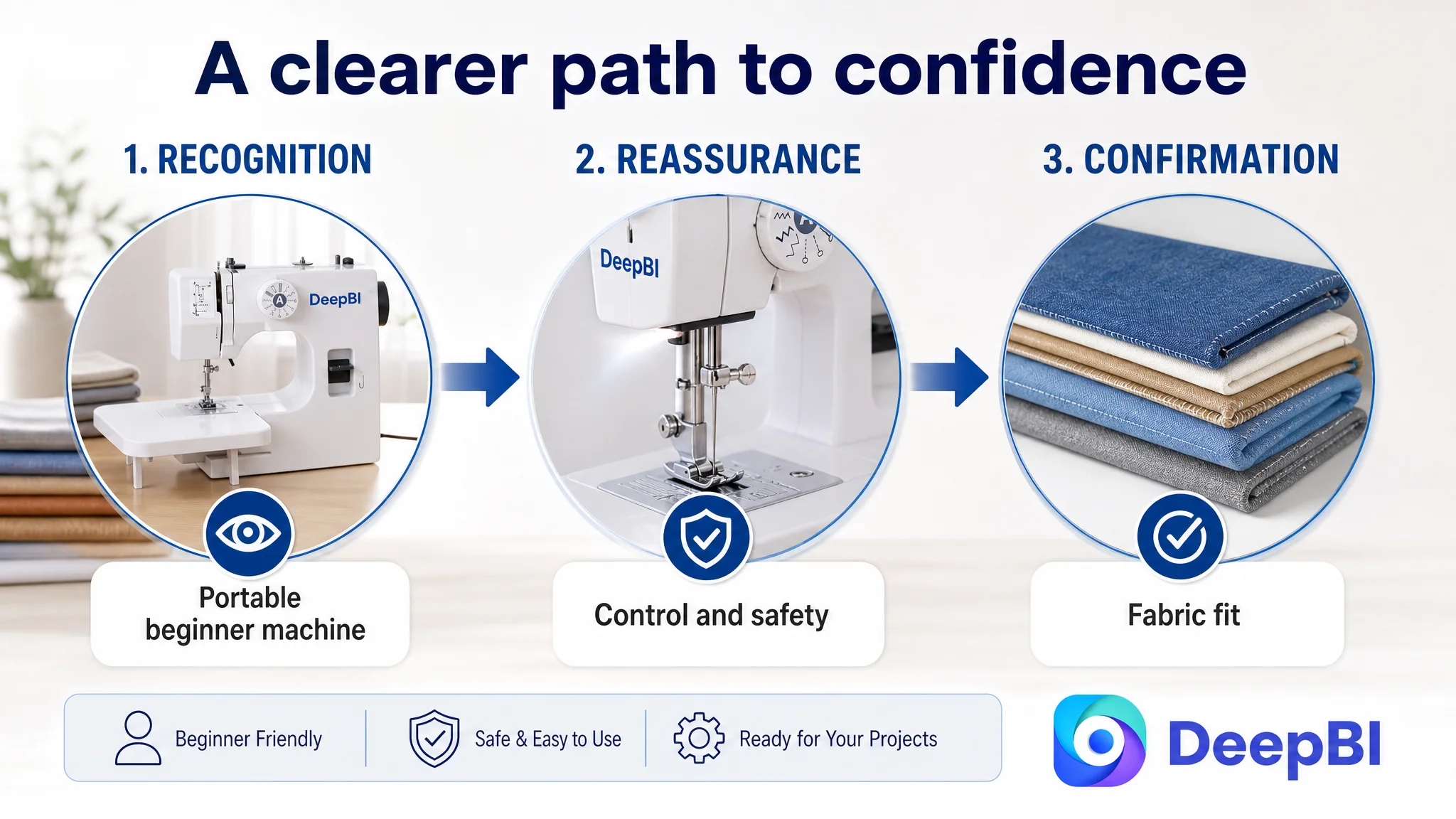
The revised strategy placed them into a clearer decision path:
1. Recognition: This is a portable household sewing machine.
2. Relevance: It is suitable for beginners and DIY use.
3. Control: It offers two speeds, button or foot-pedal operation, and LED lighting.
4. Capability: It provides multiple built-in stitches and supports defined fabric-layer use.
5. Stability: The extension table supports larger projects.
6. Readiness: The accessory kit reduces the need for additional purchases.
7. Reassurance: Safety guidance, factory testing, and support resources reduce uncertainty.
8. Confirmation: A fabric chart helps the buyer judge fit for the intended project.
This is more than a copy rewrite or image refresh. It is a change in how the Amazon Listing participates in the purchase decision.
What This Amazon Case Makes Clear
The product page did not fail because every asset was weak. Some parts were already stronger than the comparable Listing, particularly the depth and visual consistency of the A+ content.
The problem was that strong assets could not compensate for missing or poorly prioritized decision signals.
The most important lessons are:
- A high volume of Listing content does not guarantee conversion.
- Five-point descriptions must connect features to buyer concerns.
- Review quantity and rating can become a trust barrier that design alone cannot remove.
- A title should prioritize search relevance and fast comprehension rather than carry every possible feature.
- Main images should answer the buyer’s first questions before presenting technical depth.
- A+ content should establish suitability, control, safety, and confidence before detailed instruction.
- Advertising should not be used to compensate for a product page that has not clarified its value.
- The right optimization sequence depends on the bottleneck, not on the number of available assets.
For this Amazon sewing machine Listing, the next step was not to keep adding information. It was to make the existing product story easier to believe.
That is the difference between a page that describes a product and a page that helps a shopper decide.